Nova Wealth
Designing a frictionless, data-first wealth management experience.
The User & The Problem
The Fragmented Investor
Cognitive Overload
Challenge 1: Establishing Trust During Onboarding
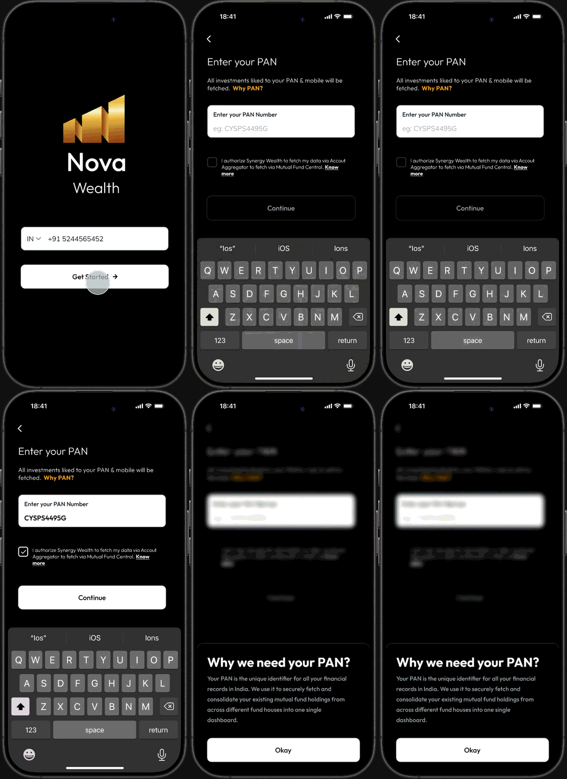
Because Nova Wealth requires fetching sensitive PAN data to aggregate portfolios, user transparency was critical. Initially, I considered placing a standard 'info' icon next to the "Why PAN?" prompt.
However, anticipating that this subtle affordance could be easily missed—and knowing that data privacy is a primary friction point—I pivoted the design before development. I transformed the entire explanatory text into a prominent, clickable component that triggers a bottom drawer. By utilizing a background blur, I forced user focus entirely onto the data explanation, successfully mitigating hesitation and building immediate trust before requesting sensitive input.
The Data-First Dashboard
Challenge 2: Escaping the Ledger
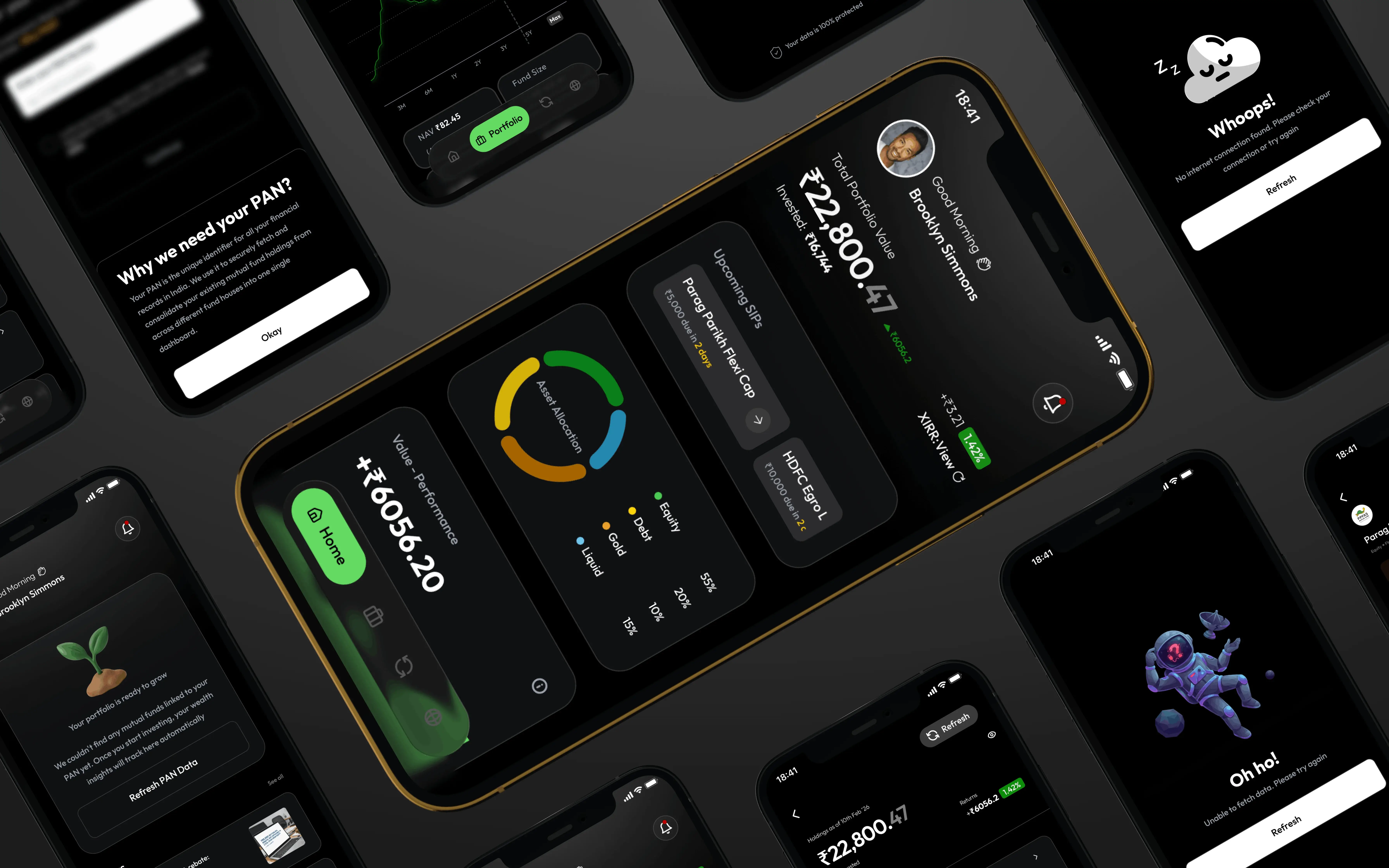
Competitor apps relied heavily on a "ledger format," burying overall performance metrics deep within the navigation. I solved this by elevating the holistic performance graph to the absolute forefront of the homepage, democratizing the most critical data instantly.
Visualizing Asset Allocation
To enhance glanceability, I introduced sector distribution visuals (asset allocation donuts) and mini spark-line graphs for individual mutual funds. This allows users to comprehend their diversification and fund-level momentum without needing to drill down.
Aesthetic Justification
The "Neon Matte Glass" UI was a deliberate, strategic choice. It provides a clean, modern aesthetic that sharply differentiates Nova Wealth from the sterile, utilitarian competitors, while the dark theme maintains a necessary sense of premium financial security.
Generative Research & Validation
Competitor Audits
The Insights
Resolution & Outcomes
Translating Requirements into Reality
The Nova Wealth project is currently in active development. The true success of this phase was achieving complete stakeholder alignment by successfully translating a highly complex Business Requirement Document (BRD) into an intuitive, scalable, and modern prototype.
By keeping the product strictly focused on the Mutual Fund and SIP domain—intentionally excluding the noise of broader stock market data—I delivered a "single pane of glass" that met the core objective: a unified, trustworthy, and heavily synthesized wealth dashboard.